

I think this does a good job of being creative as well as making you think. I also love the way the song was remixed.
Forum Thread: Inspiration Sarah Surabian
- Hot
- Active
-
 Forum Thread:
Torie Zalben Projects
2
Replies
Forum Thread:
Torie Zalben Projects
2
Replies
13 yrs ago -
 Forum Thread:
Vince Patin Projects
4
Replies
Forum Thread:
Vince Patin Projects
4
Replies
13 yrs ago -
 Forum Thread:
Final Project Doug Herrera
1
Replies
Forum Thread:
Final Project Doug Herrera
1
Replies
13 yrs ago -
Forum Thread:
Inspiration Doug Herrera
20
Replies
13 yrs ago -
 Forum Thread:
Shane O'Connor Project
5
Replies
Forum Thread:
Shane O'Connor Project
5
Replies
13 yrs ago -
 Forum Thread:
Sarah Surabian Projects
2
Replies
Forum Thread:
Sarah Surabian Projects
2
Replies
13 yrs ago -
 Forum Thread:
Projects- Kimmy Evans
5
Replies
Forum Thread:
Projects- Kimmy Evans
5
Replies
13 yrs ago -
 Forum Thread:
Projects Drew DeMartinis
2
Replies
Forum Thread:
Projects Drew DeMartinis
2
Replies
13 yrs ago -
 Forum Thread:
Sean Cronin Projects
3
Replies
Forum Thread:
Sean Cronin Projects
3
Replies
13 yrs ago -
 Forum Thread:
Kayci Thomas Projects
6
Replies
Forum Thread:
Kayci Thomas Projects
6
Replies
13 yrs ago -
 Forum Thread:
Phil Ebiner Projects
4
Replies
Forum Thread:
Phil Ebiner Projects
4
Replies
13 yrs ago -
 Forum Thread:
Kyle dePinna Projects
3
Replies
Forum Thread:
Kyle dePinna Projects
3
Replies
13 yrs ago -
Inspiration:
Vince Patin
18
Replies
13 yrs ago -
Forum Thread:
Explore- Vincent Patin
61
Replies
13 yrs ago -
Forum Thread:
Explore - Doug Herrera
68
Replies
13 yrs ago -
Forum Thread:
Inspiration Torie Zalben
13
Replies
13 yrs ago -
Forum Thread:
Inspiration - Kyle dePinna
15
Replies
13 yrs ago -
Forum Thread:
Explore - Kyle dePinna
59
Replies
13 yrs ago -
Forum Thread:
Inspiration Drew DeMartinis!!!
12
Replies
13 yrs ago -
Forum Thread:
Explore - Drew DeMartinis is exploring the world.
22
Replies
13 yrs ago
-
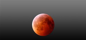 News:
Lunar Eclipse Time Lapse
News:
Lunar Eclipse Time Lapse
-
 News:
Thanks for the hard work !
News:
Thanks for the hard work !
-
News: Simple use of AE- fits the style
-
 News:
The Raven
News:
The Raven
-
 News:
Amazing Making Of...
News:
Amazing Making Of...
-
 News:
Great Stop Motion Blog
News:
Great Stop Motion Blog
-
 News:
Insane Star Trek Fan Film
News:
Insane Star Trek Fan Film
-
News:
Remove Adobe 30 Day CS4 Trial Limit
-
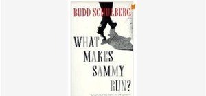
News:
Recommended Book
-
News:
Amazing 3D Object Detection
-
News:
Giant Metal Hot Wheel Set
-
News:
Please Watch - Amazing Behind the Scenes
-
News:
Un-Logo the World
-
News:
Too Funny for Words
-
News:
Perfect Advertising
-
News:
Good Color-weird trailer
-
News:
GO SEE.
-
News: A New Perspective
-
News:
The Five Obstructions
-
News:
Conviction


16 Responses
This piece looks like it was all done with stills, this is a very creative way to do things on the cheap. When you tell stories with still you realize how important each frame is and the impact each frame can have. Sometimes we get spoiled shooting at 24 or 30 FPS.
The one thing I was not a big fan of was the frames of black. Sometimes they seemed intentional, sometimes a mistake.
What message did you take away from this video, I'm curious?
I thought that this was commenting on how wrapped up we are with our brands, etc. It seemed to really say something about our use of technology (especially cell phones) and how we are never disconnected from our phone, but because of this we can be more disconnected to reality.
When I watched it again, I didn't like the black frames either.
What is your take away from the video? Do you stop participating with brands?
Im just curious if the message was cool and clever or really powerful in terms of your life has changed as a result of seeing the short? Moving the minds of your audience is the goal of any great piece and Im curious if you were moved into action as a result of seeing this short?
I wouldn't say that I was moved into action from this film... I just thought it was cool. However, I am not one of those crazy cell phone enthusiasts who is never away from their phone. I'm not sure if this short's goal is for us to take action, I thought it was more of a commentary on our society.
I have always thought this was a really cool effect.... is there a way to do something similar to this in AE?
Lots and lots of rotoscoping. This took over 2 years to finish all the rotoscoping in this movie. VERY VERY LABOR INTENSIVE, but amazing to look at. Waking Life is another with the same effect.
Also in the movie "THE FIVE OBSTRUCTIONS" which I can't recommend more for people to see, there is a segment done with this.
My inspiration for this week has to do with title sequences. I have always loved when shows/movies have really good ones. I am bummed that a lot of TV shows have abandoned the title sequence and instead just quickly flas the title.
I love the Weeds intro even though it is pretty simple. It looks like they just used 3D space and put masks on the titles. The Brady Bunch intro is a classic. I love how they use different layers and sizes, but then tie them all together by having the characters look at each other. The United States of Tara intro isn't as easy to figure out as the other ones. I think that it is a whole bunch of 3D layers, moving cameras, and lights in AE. I'd love to better understand how they did that.
This is the coolest commercial. It was made entirely out of clay, with no special effects (apparently).
As nerdy as it is, Boise State being on the cover of SI this week is pretty exciting/inspiring. I've been watching that team since I was little (I'm from Idaho) and it is really cool to see us getting some recognition.
http://www.ktvb.com/news/Where-to-find-Sports-Illustrated-103968569.html
I cant get the video in here, but this news story gives a good idea of what its like to grow up in a pretty small city. Plus, the cover itself is pretty cool.
This is my favorite commencement speech.
Here is my mustache video!
This commercial is really cool! I have no idea how they did it!
Really cool effects - and funny!
This commercial was totally revolutionary... now it feels like people use silhouettes all the time!
Te he he.... love these commercials
This is pretty cool.... it is a time lapse of a guy driving across the country! It amazes me that someone driving that far can be compressed into a cool, 4 minute video.
Share Your Thoughts